Book Cover Trends 2020
We’ve all heard the old phrase, don’t judge a book by its cover. Well… that’s exactly what readers do. Readers are roaming the shelves at Barnes & Noble or at their favorite indie bookshop, combing through their favorite sections, searching for new reads from their favorite authors, enjoying the intoxicating promise of new adventures within every tiny paperback they see. But wait, what’s this? A book catches their eye on a distant shelf. There’s something about the design that draws them in… so they walk over, pick it up, and read the synopsis. This process is the same for online readers as well, just slightly less visceral.
Readers are going to judge books by their covers, but they can’t help it! With so many amazing books to choose from in today’s publishing market, that’s how they narrow down the search initially. Since this is the case, it’s crucial for us authors to keep up with the latest in book cover trends- both so we can hop on them or so we can give them a slightly different angle to set our upcoming releases apart from the rest.

1) Bold Typography
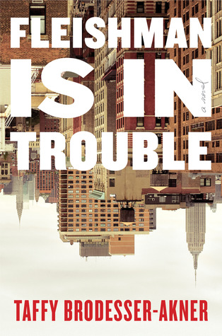
The past few years we’ve seen book covers skew toward big bold typography and we don’t expect that trend to die down this year. This is a trend where, rather than have an image be the focal point of the cover, the cover is almost completely covered in giant bold text consisting of the title and author’s name. The goal of new cover trends is always to draw attention to a book when it’s sitting on the shelves and big bold lettering has been doing the trick.

2) Cartoon Style
We’ve seen an uptick, especially within the romance and rom-com book genres, of covers featuring a minimalistic cartoon-ish style. In the past, romance covers have been hyper-realistic, featuring real models in various romantic poses and settings. This shift toward a more cartoon style is allowing new romance books that are hitting the shelves to stand out and catch readers’ attention more when sitting among the model versions of old.

3) Object focal point
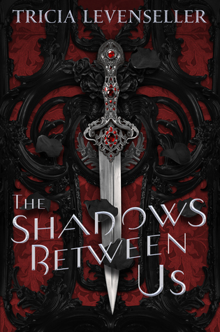
This trend began in the fantasy genre, but we’ve begun to see it branch out to various genres and expect it to continue to do so in 2020. This cover design trend revolves around a single object or image being used as the focal point of the cover among a plainer background. The object or image chosen will be one that encapsulates some aspect of the story within. With fantasy books, we’ll often see this style of cover done with a crown, throne, sword, etc. beautifully illustrated at the center of the cover.

4) Rainbow/Technicolor
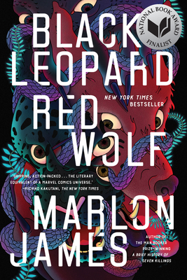
In the past, cover artists have been very hesitant about choosing too many colors for their covers (usually opting for one or two colors tops). But we anticipate seeing more and more technicolor/rainbow covers this year as some have already started hitting the shelves. Artists have found a way to keep all of these colors from contrasting or overwhelming the senses by creating a psychedelic effect. This creates the bold eye-catching look they’re after without appearing sloppy.

5) Text and Images Overlapping
As we move into 2020, another trend we’re already seeing begin to form is text and images overlapping with one another. As designs get more and more advanced, cover designers are leaning into layering images to create a unique and more three-dimensional cover image. They’ve even gone so far in some cases as to have the text weaving in and out of the cover image, creating a textured effect that’s sure to capture a bookstore goer’s imagination.

6) Hand lettering
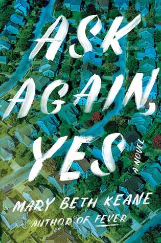
We’ll likely see more hand-lettering covers coming onto the market as well, which we started to see some of last year. Although the hand-lettered trend has been around for a few years now, we expect to see them get more and more realistic throughout the year. Rather than using fonts that mimic human handwriting, we’ll likely see fonts that use the real thing- creating an immediate personal connection between the protagonist and the reader.
