Choosing the Right Book Cover
We’ve said it before and we’ll say it again: your book cover is important. We can’t overstate how crucial having a good book cover is to the success of your book. If you decide to traditionally publish your book, you’ll be working with your publisher on the book cover so full creative control won’t rest on you. However, with self-publishing, your book cover is entirely up to you. Most authors at least have the sense to tell the difference between a good book cover and a bad one. You can likely spot a bad photoshop job from a mile away, so we won’t get into that in this post. However, it’s also crucial that your book cover relates to your material, specifically when it comes to your book genre.
Imagine you’re walking around a bookstore looking for something new to read. Usually, you pick up a book when you’re intrigued by a cover that looks like it’s from a genre you’re interested in reading. As an author, that means if you choose a cover that differentiates from the genre of your book, the wrong readers will be picking up (most likely putting back down) your book.
So how do you know what kind of book cover would match your book? Obviously, you should do your own research by looking up other books in your genre and imagine similar covers for your book. But we’ve compiled some suggestions for you as well:
1) Contemporary

Typically, contemporary covers are rather simple. Many have little cartoonish illustrations of one or two of the characters or an object that’s significant or symbolic in the book. Others will have actual photographs, whether stock photo images or perhaps the author hires models to pose as their characters. Another common contemporary cover would be a photo of a landscape. Figure out what is most relevant to your content and highlight it keeping these ideas in mind.
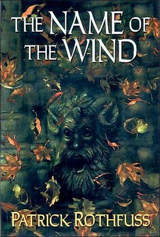
2) Fantasy

This is a more imaginative genre and your cover should reflect that while still remaining relevant to the content of your book. A tell-tale indication that it’s a fantasy book is if the cover has one of the following: a crown, a sword, a helmet, a throne, or a dragon (Oh and don’t just stick with dragons–illustrations of animals like lions or phoenixes are also popular for fantasy books). Another common choice is to have an artist hand-draw characters or a relevant scene from your book. This choice is very popular, especially for adult fantasy books…just make sure it relates to your content.
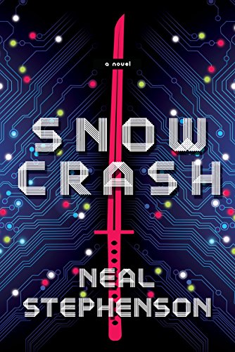
3) Science Fiction

The majority of science fiction works are dystopian and many have dark overtones. Typically, the covers reflect this. It’s also common for a science fiction book cover to depict some of the technology that a reader should expect to find within the book. Whether that’s a hand-drawn illustration of a spaceship, a space gun, a spacesuit, or even a circuit board. If your book takes place another planet, it’s common to depict that on the cover. You may even design the entire city landscape on the cover. Just remember that, while contemporary novels may be light and romantic, your city would need a darker overtone and the illustration would need to clearly show a technological difference between this city and one we’d be able to find in our world today. If none of this appeals to you, check out some old science fiction covers like Dune or The Hitchhiker’s Guide to the Galaxy and create a cover with a similar vintage feel. This is an especially good design route to take if you think your book would appeal to similar readers.
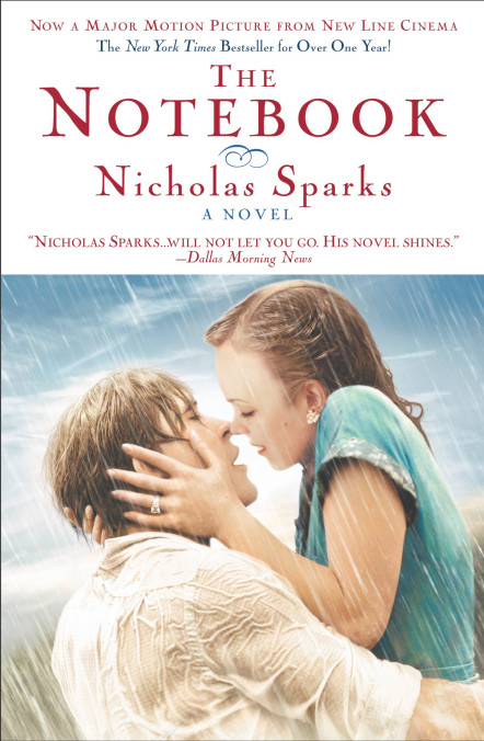
4) Romance

Obviously, these covers vary, but if you want readers to know right away that they’re picking up a romance novel, the easy solution is having a couple on the cover. There are various ways you can do this, whether it’s with an illustration or a photograph, so do your research and figure out what works best for your book. Another common choice is a girl in a beautiful, flowing dress (often running). Finally, a third good indicator of a romance novel is to have something either stereotypically romantic or relevant to the couple within your book. This could mean a picture of flowers, a butterfly, or (if your book involves letters) perhaps a set of letters. Think about what items are important to the couple in your story to help you draw some inspiration.
5) Nonfiction

When it comes to nonfiction book covers, less is more. A lot of covers depict simply the title and author in a nice font. They may play around with the actual color of the cover and font, but they will often not include an image or, if they do, it is very small. Any image or photograph that you include in the cover should be directly and clearly significant to the content. Whereas with fiction books these items can be elusive, with nonfiction they need to very clearly deal with the content. So, if the book is about the history of a city, having a photograph of the city as the cover would work. Or, if the book is about how to play the guitar, include a small photo or illustration of a guitar. You can play around with how modern or vintage it looks, but make sure the images are relevant. This isn’t the time to be imaginative. Just be simple, clear, and concise. Otherwise, you’ll have fiction readers picking up your book instead.
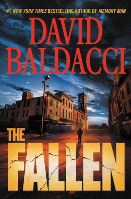
6) Suspense/Mystery

This genre’s cover is relatively easy. All you need is a bold font choice that takes up almost the entire cover and perhaps a backdrop of an item or place that relates in some way to the plot or title of the book. If your book involves someone drowning in a lake, throw in a photo or drawing of an eerie lake. Or, if your book involves a pocket watch, include one in the center between the title and author name. Keep in mind, though, not to accidentally give away a clue through the item you choose. For example, if the pocket watch is going to end up being the key to the mystery, choose a different item. Whatever is on the cover, astute readers will be on the lookout for it. Make sure you choose an item or location that’s relevant without being the key to solving your mystery.
